Pastel colours: The Trend Transforming Design and Corporate Gifts
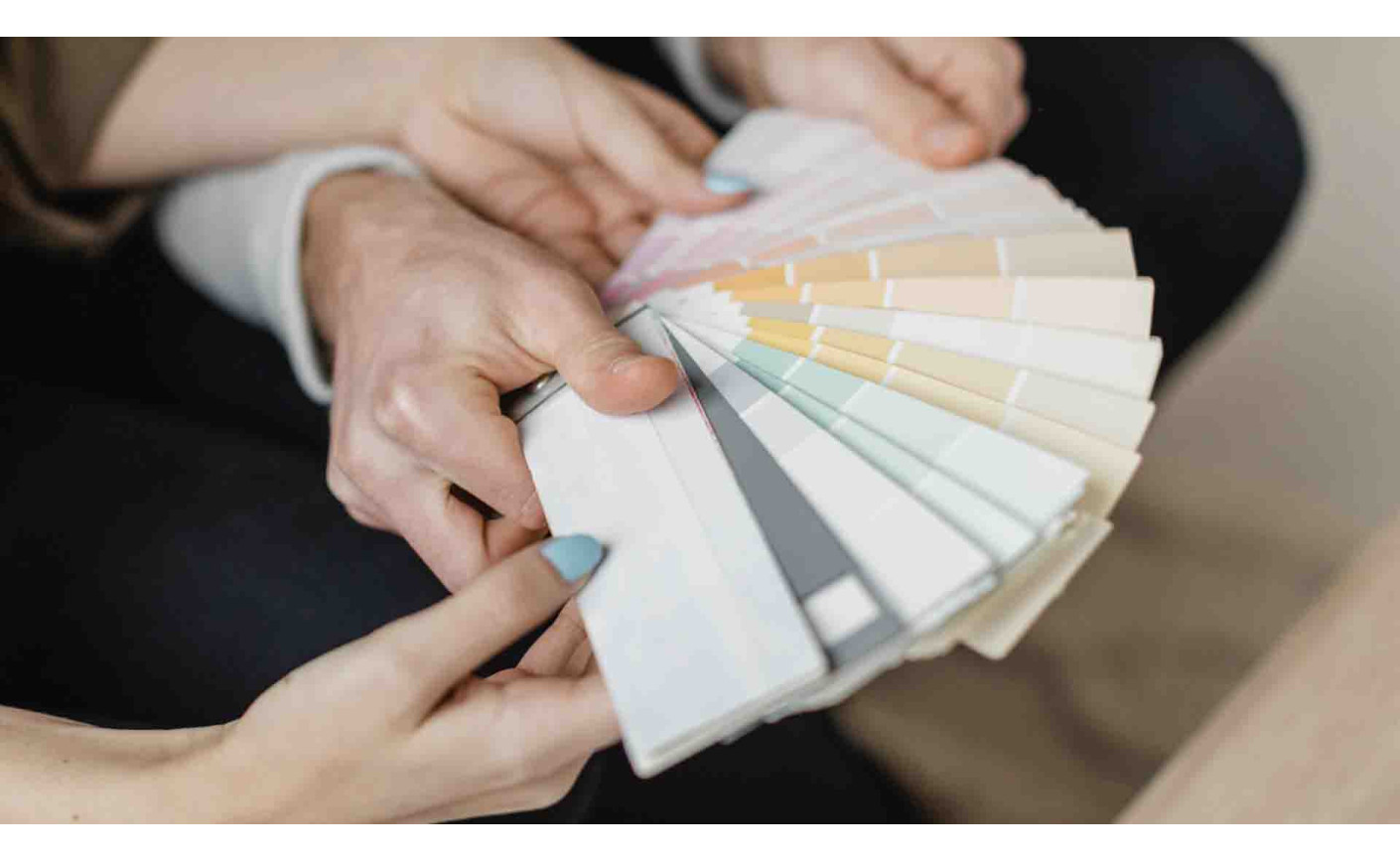
Pastel colors are trending in design, fashion, home decor, and corporate branding. Soft, balanced, and visually appealing, they convey calmness, elegance, and lightness, while still being striking and memorable. For this reason, they are a strategic choice for brands aiming to communicate in a more human, emotional, and modern way.
In this article, you will discover why pastel tones continue to grow in popularity, what makes them special, and how to use them in design, digital campaigns, home decor, and even in custom promotional gifts.
So, what exactly are pastel colours?
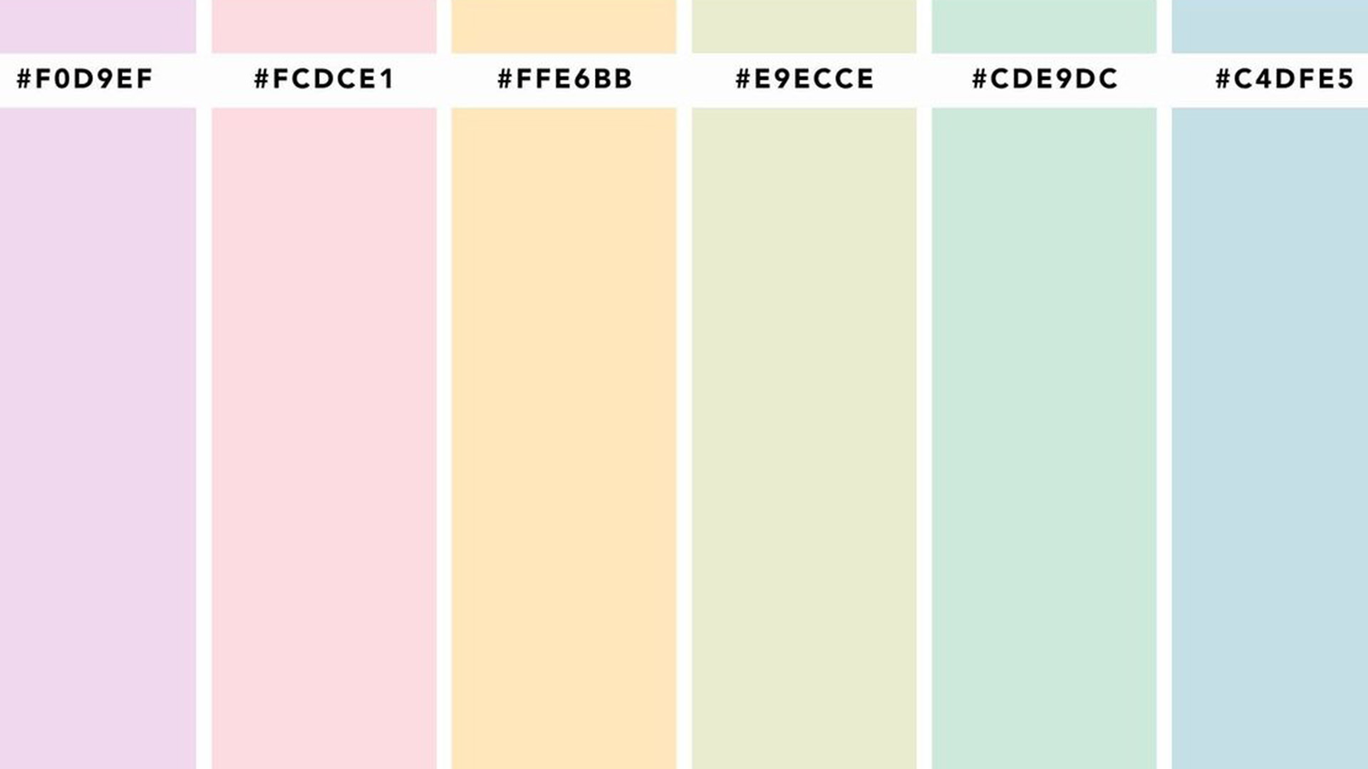
Pastel colors are soft tones with a high proportion of white in their composition, resulting in light, delicate, and “washed-out” shades. They evoke lightness, serenity, nostalgia, and delicacy, often associated with spring, wellbeing, and visual comfort.
Classic examples include:
-
Light pink
-
Sky blue
-
Mint green
-
Lavender
-
Butter yellow
-
Soft peach
These colors are easy on the eyes, combine well together, and create a harmonious visual aesthetic—perfect for brands looking to reinforce positive feelings.
Why are pastel tones so popular?
1. Universal Appeal
Pastel colors work across a variety of styles, including minimalist, romantic, modern, or sophisticated. They can appear in spaces, outfits, packaging, visual identities, or advertising campaigns, always enjoying high public acceptance.
2. Emotional Communication
Brands that use pastel tones convey closeness, care, and empathy, values especially relevant in industries such as:
-
Beauty and cosmetics
-
Health and wellness
-
Education
-
Sustainability
-
Corporate communication
This palette communicates gently and helps create immediate emotional connections with the audience.
3. Boldness with Softness
Pastels allow brands to stand out elegantly. A lavender logo, a mint green package, or a soft yellow digital background draws attention without overwhelming the visual space, creating impactful yet subtle communication.
Pastel tones in marketing and promotional gift design
In the world of custom promotional gifts, pastel tones have gained popularity for conveying:
-
delicacy
-
attention to detail
-
customer care
-
sustainability
-
wellbeing
They are perfect for brands seeking to create a positive emotional experience.
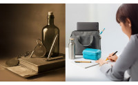
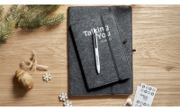
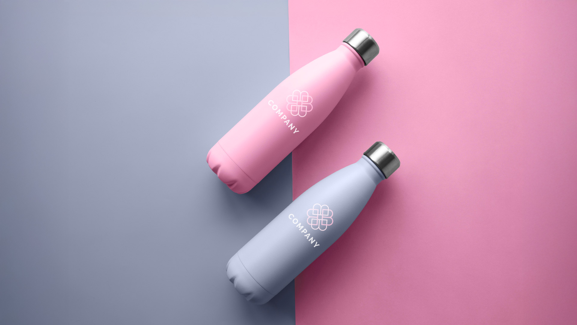
A soft pink notebook or a sky-blue thermal bottle stands out visually, reinforces brand positioning, and provides a useful, aesthetically pleasing item that customers truly want to use.
Pastel gifts also perform well on social media thanks to their high shareability and visual appeal, an important advantage for any marketing strategy.
Soft trend in decor, fashion and branding
Decor: Lightness and Wellbeing
Spaces featuring pastel tones convey tranquility and comfort. They are widely used in:
-
Offices and creative spaces
-
Baby rooms
-
Meeting rooms
-
Relaxation areas
Sky blue, mint green, and lavender help create visually balanced, clean, and pleasant environments for daily life.
Fashion: Modern Elegance
In fashion, pastel colors represent accessible sophistication. They can be used in:
-
Monochromatic looks
-
Soft combinations with neutral tones
-
Key pieces for spring and summer
Pastels are modern, versatile, and perfect for conveying a fresh, contemporary image.
Branding and Digital Communication
More and more brands are using pastel palettes to enhance personality and humanize their communication, especially in:
-
Logos
-
Packaging
-
Websites
-
Social media
-
Corporate campaigns
In digital contexts, these colors provide clean, friendly, and ap

Conclusion: softness that stands out
Pastel colours are not merely a passing trend. They represent a powerful visual strategy for strengthening brand communication and creating an immediate emotional connection with audiences. Soft tones convey calm, trust and authenticity, while maintaining sophistication and visual balance. In an environment where brands compete for attention, this refined approach allows differentiation without excess, reinforcing a consistent identity across every touchpoint.
If your goal is to project a modern, human and memorable image, now may be the right time to explore a softer palette across branding, campaigns and personalised promotional gifts. When applied to corporate gifts or business promotional items, these colours enhance perceived quality and encourage everyday use, extending brand visibility over time. Careful selection of materials and finishes reinforces visual consistency and supports communication aligned with audience expectations.
In the world of promotional merchandise, impact is not driven by colour alone, but by the harmony between aesthetics, usefulness and intent. Pastel tones thoughtfully integrated into personalised gifts create a discreet yet consistent presence, strengthening emotional connections with recipients. Because in design and marketing, it is not always the boldest choice that leaves a mark — often, it is the most subtle one that stays in the memory.